Reimagining Fear: A Design Project for NoSleep Magazine
This project delves into the thrilling and chilling world of NoSleep, a prominent online community dedicated to user-generated horror fiction. The objective was to create a comprehensive visual identity for a fictitious magazine iteration of NoSleep, catering to an audience captivated by suspense and the macabre.
Scope of Work
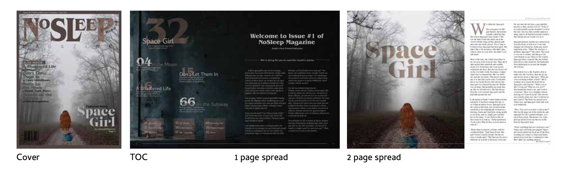
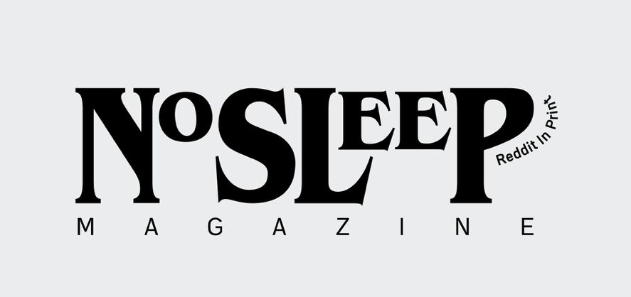
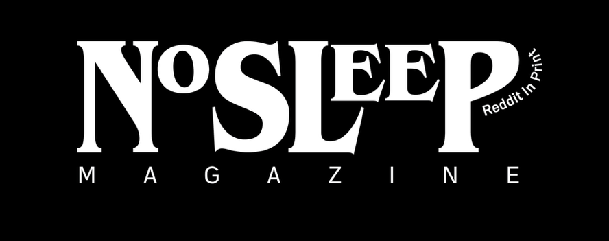
Logo Design: Crafting a logo that encapsulates the essence of NoSleep – a symbol that evokes a sense of unease, intrigue, and the chilling nature of the narratives.
Color Palette Selection: Developing a color scheme that amplifies the stories' unsettling atmosphere, utilizing a carefully chosen range of colors to evoke tension, mystery, and the unknown.
Typographical Treatment: Meticulously selecting fonts that complement the logo design and overall aesthetic. The typography should enhance readability while fostering an unsettling or suspenseful mood.
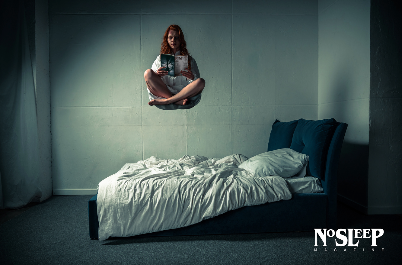
Imagery Exploration: Conceptualizing and incorporating imagery that aligns with the horror genre yet maintains a distinct NoSleep identity. This could include unsettling photography, minimalist illustrations, or haunting collages.
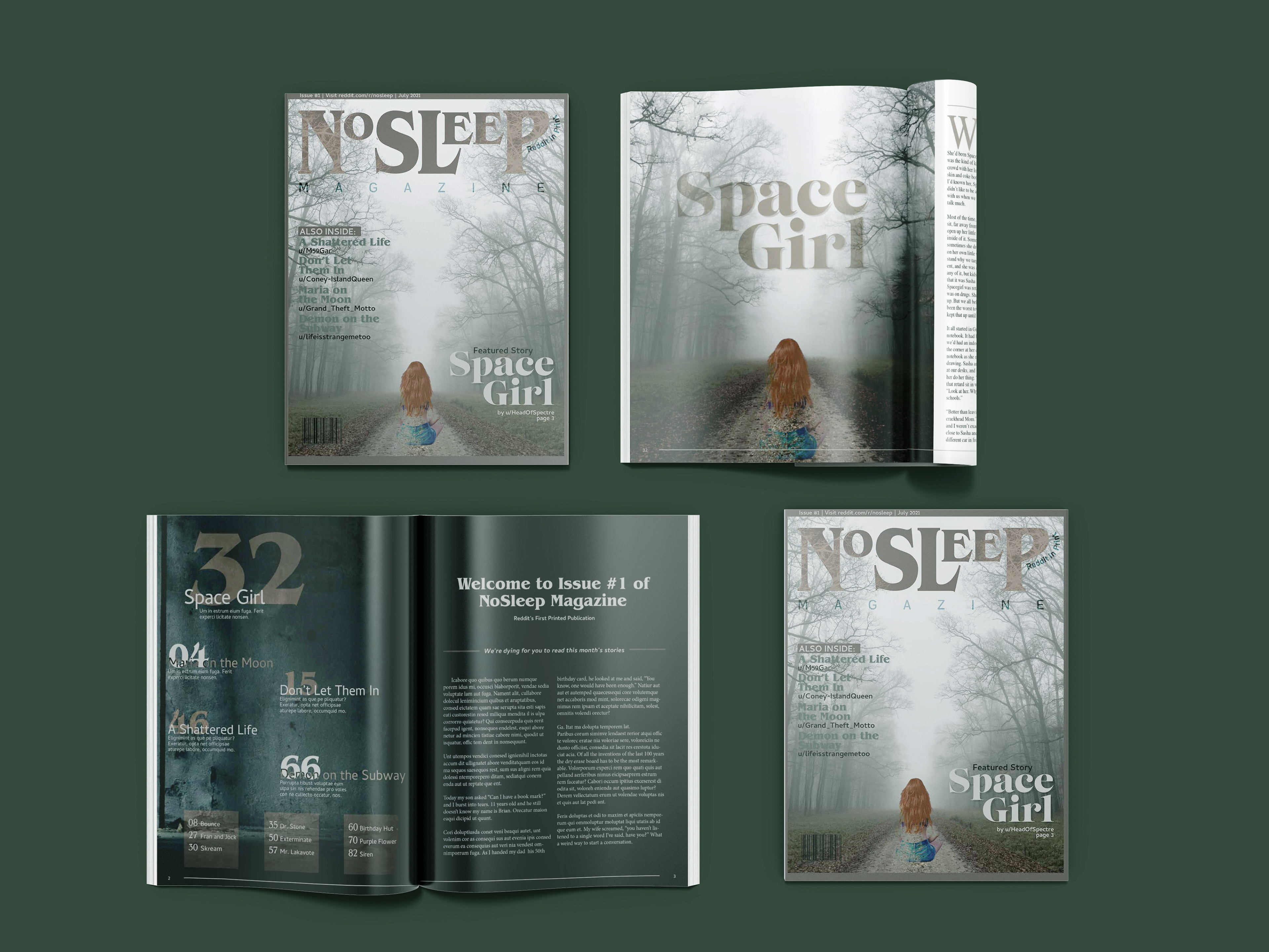
Layout Design: Developing a user-friendly and visually captivating layout for the magazine, ensuring readability and hierarchy while maintaining a cohesive brand experience across all pages.
This project goes beyond mere aesthetics. It strives to create a visual language that resonates with the NoSleep community, amplifying the chilling power of the user-generated stories and drawing readers deeper into the world of horror.
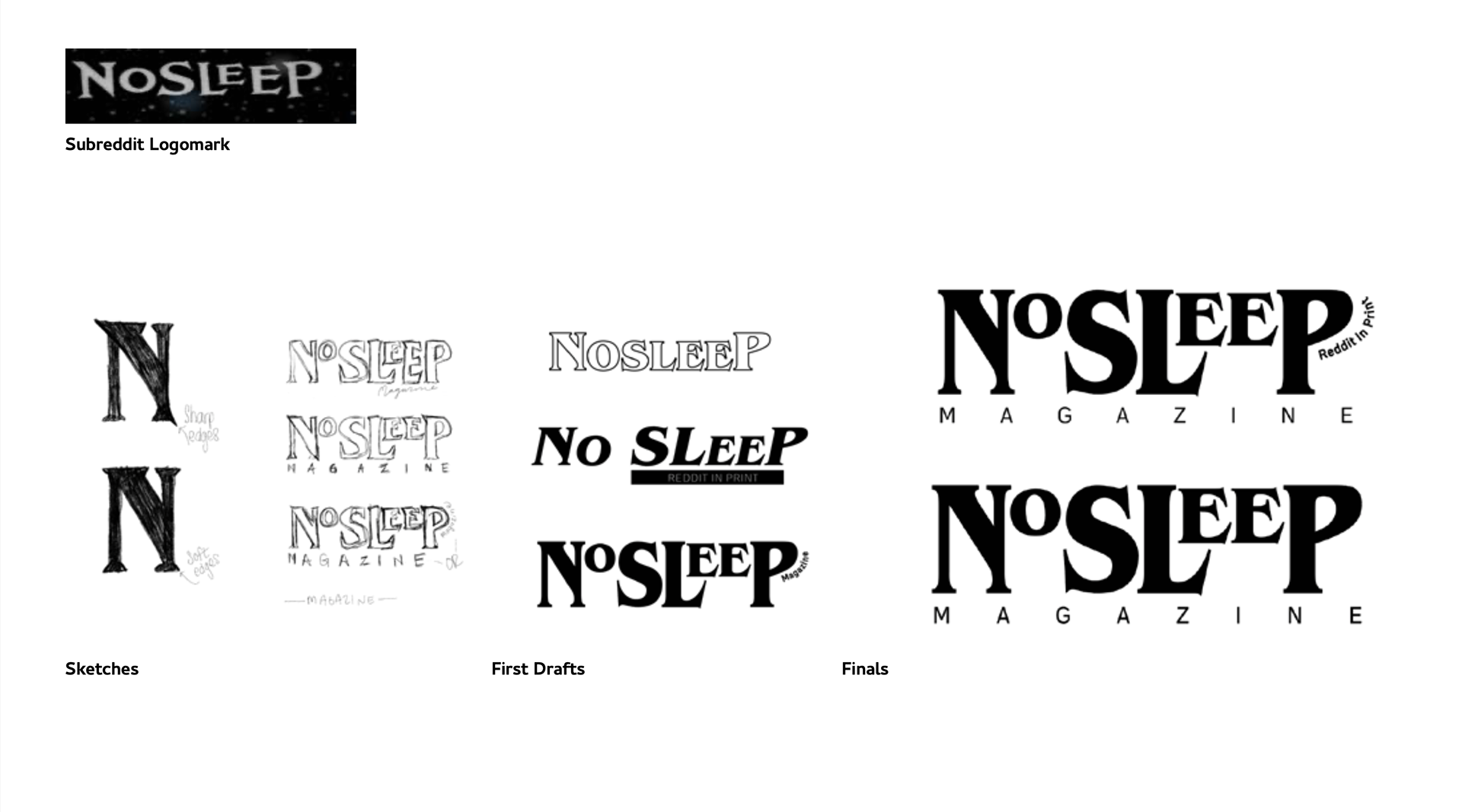
Logo Exploration
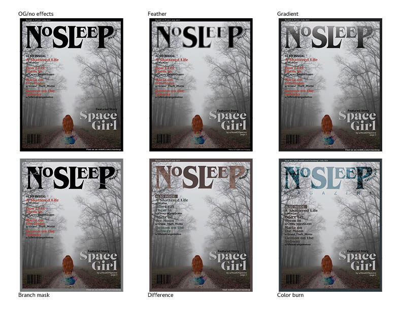
Cover Exploration